2020-04-30
This blog post was originally published as a Towards Data Science article here.
In this blog post, we are going to explore the basic properties of histograms and kernel density estimators (KDEs) and show how they can be used to draw insights from the data.
Histograms are well known in the data science community and often a part of exploratory data analysis. However, we are going to construct a histogram from scratch to understand its basic properties.
Kernel Density Estimators (KDEs) are less popular, and, at first, may seem more complicated than histograms. But the methods for generating histograms and KDEs are actually very similar. KDEs are worth a second look due to their flexibility. Building upon the histogram example, I will explain how to construct a KDE and why you should add KDEs to your data science toolbox.
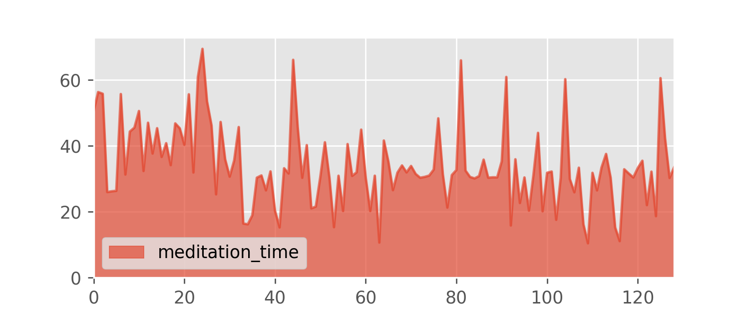
To illustrate the concepts, I will use a small data set I collected over the last few months. Almost two years ago I started meditating regularly, and, at some point, I began recording the duration of each daily meditation session.
As you can see, I usually meditate half an hour a day with some weekend outlier sessions that last for around an hour. But sometimes I am very tired and I meditate for just 15 to 20 minutes. I end a session when I feel that it should end, so the session duration is a fairly random quantity.
The meditation.csv data set contains the session durations in minutes.
I would like to know more about this data and my meditation tendencies. For example, how likely is it for a randomly chosen session to last between 25 and 35 minutes?
For starters, we may try just sorting the data points and plotting the values.
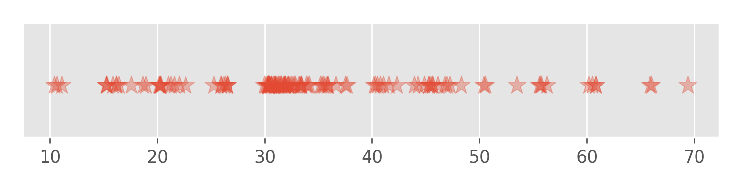
The problem with this visualization is that many values are too close to separate and plotted on top of each other: There is no way to tell how many 30 minute sessions we have in the data set. Instead, we need to use the vertical dimension of the plot to distinguish between regions with different data density. This idea leads us to the histogram.
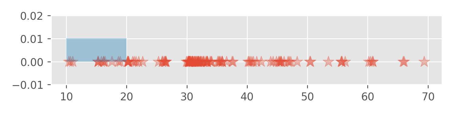
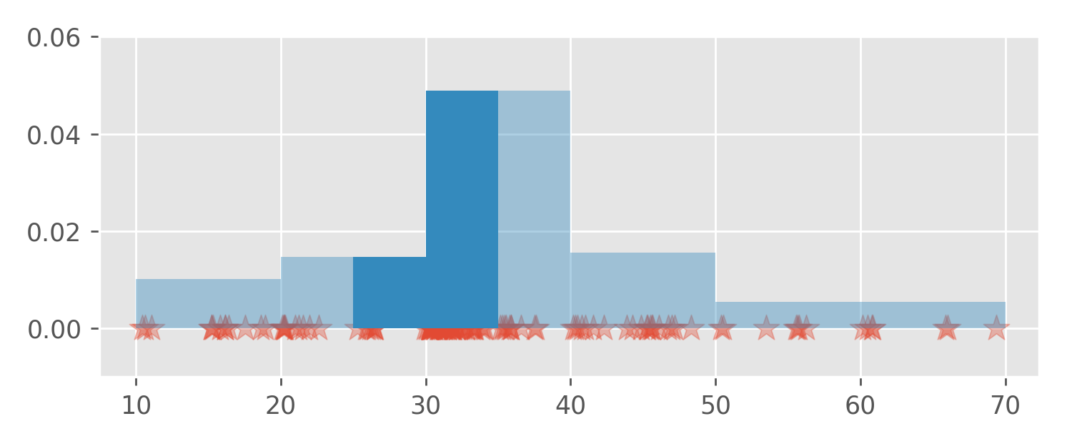
Let’s divide the data range into intervals:
[10, 20), [20, 30), [30, 40), [40, 50), [50, 60), [60, 70)We have 129 data points. For each data point in the first interval
[10, 20) we place a rectangle with area 1/129
(approx. 0.007) and width 10 on the interval
[10, 20). It’s like stacking bricks. Since we have 13 data
points in the interval [10, 20) the 13 stacked rectangles
have a height of approx. 0.01:
What happens if we repeat this for all the remaining intervals?
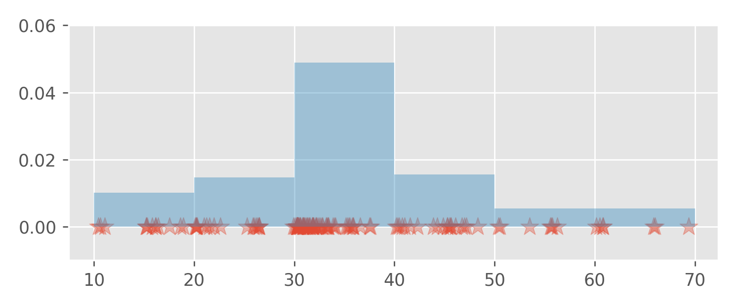
Since the total area of all the rectangles is one , the curve marking the upper boundary of the stacked rectangles is a probability density function.
Densities are handy because they can be used to calculate
probabilities. For example, to answer my original question, the
probability that a randomly chosen session will last between 25 and 35
minutes can be calculated as the area between the density function
(graph) and the x-axis in the interval [25, 35].
This area equals 0.318.
Please observe that the height of the bars is only useful when combined with the base width. That is, we cannot read off probabilities directly from the y-axis; probabilities are accessed only as areas under the curve. This is true not only for histograms but for all density functions.
Nevertheless, back-of-an-envelope calculations often yield satisfying
results. For example, from the histogram plot we can infer that
[50, 60) and [60, 70) bars have a height of
around 0.005. This means the probability of a session
duration between 50 and 70 minutes equals approximately
20*0.005 = 0.1. The exact calculation yields the
probability of 0.1085.
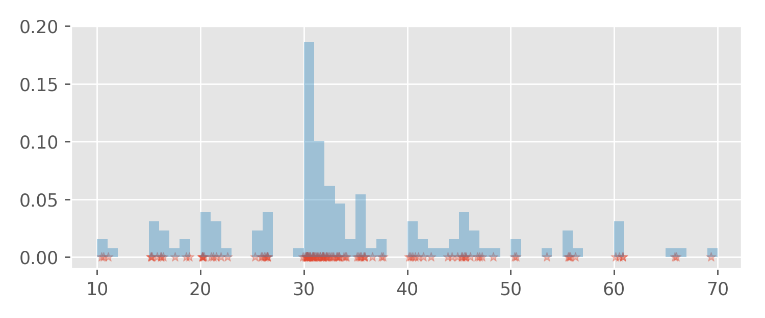
The choice of the intervals (aka “bins”) is arbitrary. We could also partition the data range into intervals with length 1, or even use intervals with varying length (this is not so common). Using a small interval length makes the histogram look more wiggly, but also allows the spots with high observation density to be pinpointed more precisely. For example, sessions with durations between 30 and 31 minutes occurred with the highest frequency:
Histogram algorithm implementations in popular data science software
packages like pandas automatically try to produce
histograms that are pleasant to the eye.
A density estimate or density estimator is just a fancy word for a guess: We are trying to guess the density function f that describes well the randomness of the data.
However we choose the interval length, a histogram will always look wiggly, because it is a stack of rectangles (think bricks again). Sometimes, we are interested in calculating a smoother estimate, which may be closer to reality. For that, we can modify our method slightly.
The histogram algorithm maps each data point to a rectangle with a fixed area and places that rectangle “near” that data point. What if, instead of using rectangles, we could pour a “pile of sand” on each data point and see how the sand stacks?
For example, the first observation in the data set is
50.389. Let’s put a nice pile of sand on it:
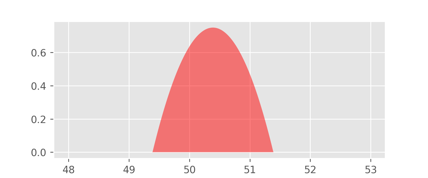
Our model for this pile of sand is called the Epanechnikov kernel function:
K(x) = \frac{3}{4}(1 - x^2),\text{ for } |x| < 1
The Epanechnikov kernel is a probability density function, which means that it is positive or zero and the area under its graph is equal to one. The function K is centered at zero, but we can easily move it along the x-axis by subtracting a constant from its argument x.
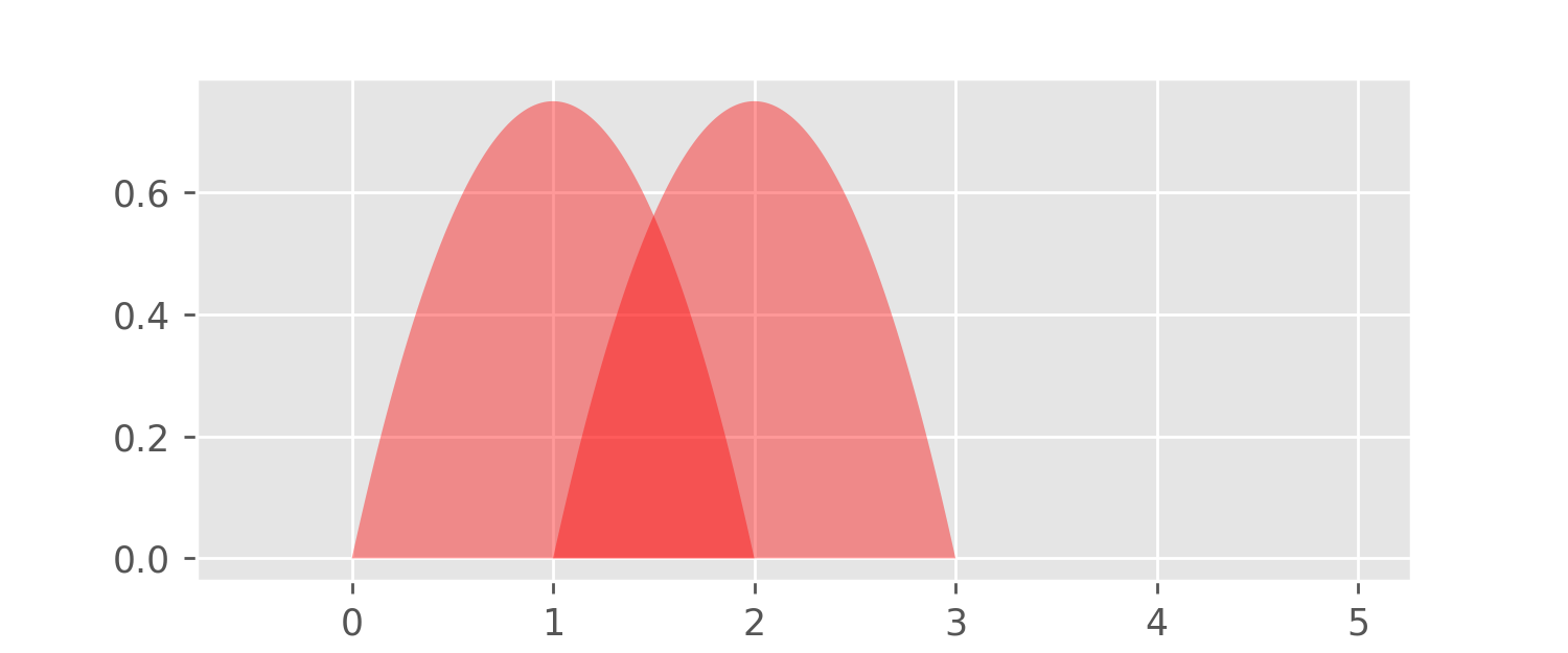
The above plot shows the graphs of
x \mapsto K(x - 1) \text{ and } x\mapsto K(x - 2).
Next, we can also tune the “stickiness” of the sand used. This is done by scaling both the argument and the value of the kernel function K with a positive parameter h:
x \mapsto K_h(x) = \frac{1}{h}K\left(\frac{x}{h}\right).
The parameter h is often referred to as the bandwidth.
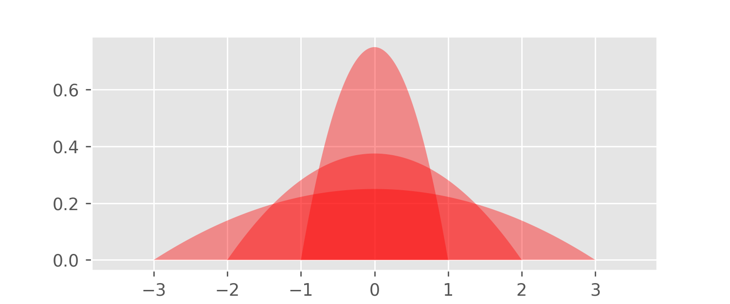
The above plot shows the graphs of K_1, K_2, and K_3. Higher values of h flatten the function graph (h controls “inverse stickiness”), and so the bandwidth h is similar to the interval width parameter in the histogram algorithm. The function K_h, for any h>0, is again a probability density with an area of one – this is a consequence of the substitution rule of Calculus.
Let’s generalize the histogram algorithm using our kernel function
K_h. For every data point x in our data set containing 129
observations, we put a pile of sand centered at x. In other words, given the observations
x_1,...,x_{129},
we construct the function
f: x\mapsto \frac{1}{nh}K\left(\frac{x - x_1}{h}\right) +...+ \frac{1}{nh}K\left(\frac{x - x_{129}}{h}\right).
Note that each sandpile
\frac{1}{nh}K\left(\frac{x - x_i}{h}\right),
has the area of 1/129 – just like the bricks used for
the construction of the histogram. It follows that the function f is also a probability density function (the
area under its graph equals one). Let’s have a look at it:
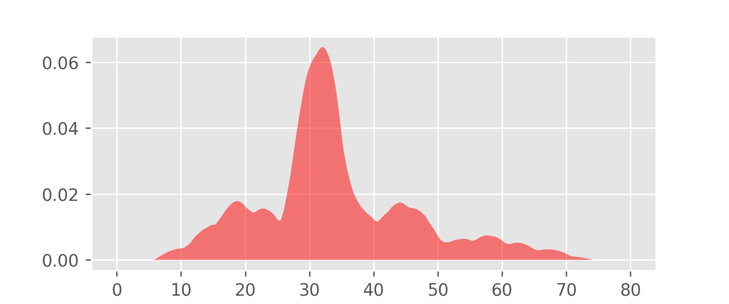
Note that this graph looks like a smoothed version of the histogram plots constructed earlier.
The function f is the Kernel Density Estimator (KDE).
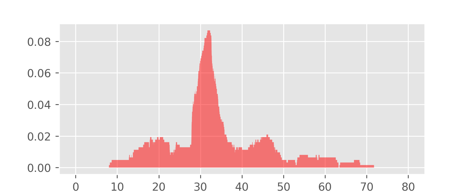
The Epanechnikov kernel is just one possible choice of a sandpile model. Another popular choice is the Gaussian bell curve (the density of the Standard Normal distribution). Any probability density function can play the role of a kernel to construct a kernel density estimator. This makes KDEs very flexible. For example, let’s replace the Epanechnikov kernel with the following “box kernel”:
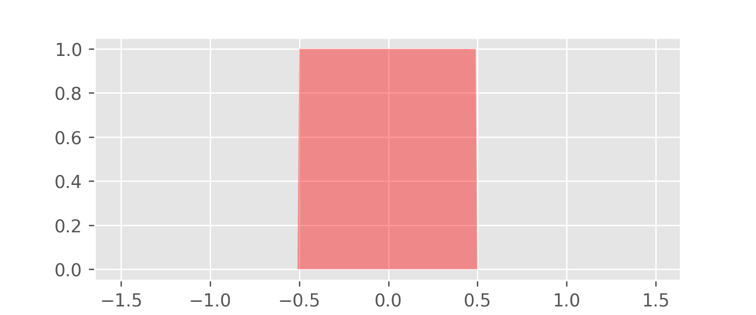
A KDE for the meditation data using this box kernel is depicted in the following plot.
Most popular data science libraries have implementations for both
histograms and KDEs. For example, in pandas, for a given
DataFrame df, we can plot a histogram of the data with
df.hist(). Similarly, df.plot.density() gives
us a KDE plot with Gaussian kernels.
The following code loads the meditation data and saves both plots as PNG files.
df = pandas.read_csv('meditation.csv', header=0)
df.plot.density()
plt.savefig('pandas_kde.png')
df.hist()
plt.savefig('pandas_hist.png')In this blog post, we learned about histograms and kernel density estimators. Both give us estimates of an unknown density function based on observation data.
The algorithms for the calculation of histograms and KDEs are very similar. KDEs offer much greater flexibility because we can not only vary the bandwidth, but also use kernels of different shapes and sizes.
The python source code used to generate all the plots in this blog post is available here: meditation.py
Many thanks to Sarah Khatry for reading drafts of this blog post and contributing countless improvement ideas and corrections.